New Logo
![]()
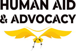
Our New Logo
With the need to stand out from the crowd while focusing on becoming experts in supporting survivors in countries where there is war and persecution, Human Aid has decided to rebrand to become Human Aid & Advocacy. We have changed our colour scheme and logo, announcing the departure from the recognisable green we have displayed for over 12 years.
The new colour scheme, featuring a striking yellow, often associated with the ‘outlaw’ brand archetype, reflects the refined concept of the charity. A colour not often used in the Muslim charity sector. It brings hope, renewal, nonconformity and also symbolises a revolutionary proclamation, marking a renewed stand against injustice: to lift up survivors from the clutches of oppression and support them in regaining their freedom.
Human Aid & Advocacy’s new logo features a bird: wings wide open, subtly evocative of the charity’s former HAUK acronym.
We drew influences from birds and wings that have many connotations in our deen (Islam). We found particular significance in the story of Surah Fil and the oppressive King, Abraha who came to destroy the Ka’bah and was defeated by an army of small birds (Ababeel) showing that even the smallest seemingly insignificant creatures can have the largest impact if rightly guided.
The bird can be seen carrying away a line of barbed wire, symbolising the lifting of oppression and the charity’s vision ‘to see a world where believers can worship Allah free from the fear of war and persecution’. The overall concept demonstrates hope, strength and freedom. It reflects the organisation’s willingness to stand against injustice, lift oppression and support survivors to regain their freedom and independence.
Below is an animation showing the logo coming to life.

© Copyright 2026 Human Aid & Advocacy. All rights reserved. Registered Charity No. 1138111